Posts

Showing posts from February, 2017

Analysing whole magazine - cover, contents page, editor's letter, double page spread

Image
Dave Grohl the singer/guitarist and the leader of the rock band ‘Foo Fighters’ is placed on the centre right of the magazine cover. The picture taken is medium shot at a low angle, he is bigger and more towards the front compared to his band members which clearly emphasises his position as a band ‘leader’. The band members are wearing mostly black and dark colours also grey and denim, which is typical for a rock band but still modern and casual rather than ‘KISS’ excessive style. The colour of their clothing also doesn’t distract the colours of the coverlines . The colour scheme of white, grey, black and red all contrast between each other which makes the cover clear to read and look at without confusion as all of these colours can work on top of each other. The coverlines are clear because of the colours and the font used. The main article about Foo Fighters is in a bigger font compared to the other articles. It talks about their new album and it expressing Dave’s pas

Representation magazine covers

Preliminary task: school magazine cover and contents page

Image

Preliminary task questionnaire + answers

Image

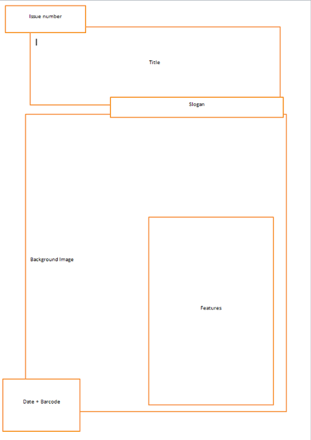
Preliminary task planning out magazine cover

Image

Preliminary task 4 school magazine contents pages analysis

Image

Preliminary task 4 school magazine covers analysis

Image
The masthead of ‘The Civitas ’ magazine stands out the most as it is in a bigger font than any other text on the front cover. It is also placed on a maroon background and it’s written in white which makes it more visible too. The white and maroon colours relate to the school theme and logo. The front cover of this magazine doesn’t have much information or writing because the photo is colourful and shows a lot, which doesn’t give the need to write more. The children are holding charity buckets which clearly indicates the school wants to help people and also show their best side to the public and encourage to do the same. The school called their magazine ‘The Civitas ’ which stands for citizenship, especially as imparting shared responsibility, a common purpose, and sense of community. This designates that the school wanted to portrait their school as a great community and the topic ‘Citizens for change’ proves it. 

Conventional magazine double page spread

Analysing double page spread

Conventional magazine editor's letter

Analysing editor's letter

Conventional magazine contents page

Image

Analysing contents page

Conventional magazine cover page

Image